

Introduction:
The modern shopper thrives on convenience, speed, and control. Recognizing this, Adika, an online fast-fashion powerhouse, set out to redefine its mobile checkout experience, aiming to give customers a greater sense of control, increase conversion rates, and, ultimately, foster deeper relationships with its clientele.

Ease, Speed, Control:
The primary objective was to optimize the mobile checkout process, making it faster, more intuitive, and more transparent. We aimed to give customers a sense of empowerment and control during their shopping experience, keeping them updated on their selected items and seamlessly guiding them through the purchase process.
Fast lane:
The Checkout page, one of the most crucial components of any e-commerce site, has been successfully reimagined. The objective was to ensure that customers remain engaged in this critical stage, where the intent to purchase is paramount.

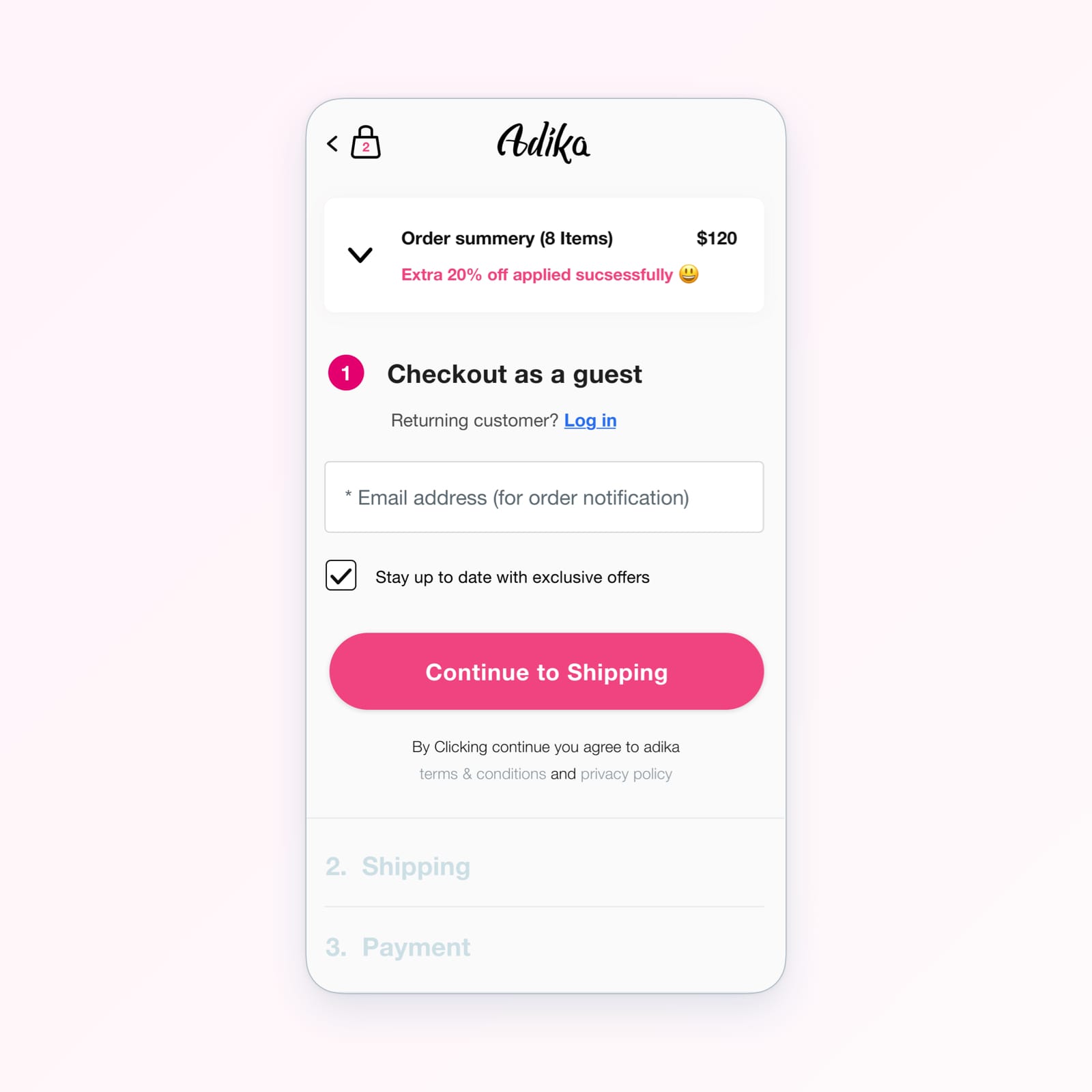
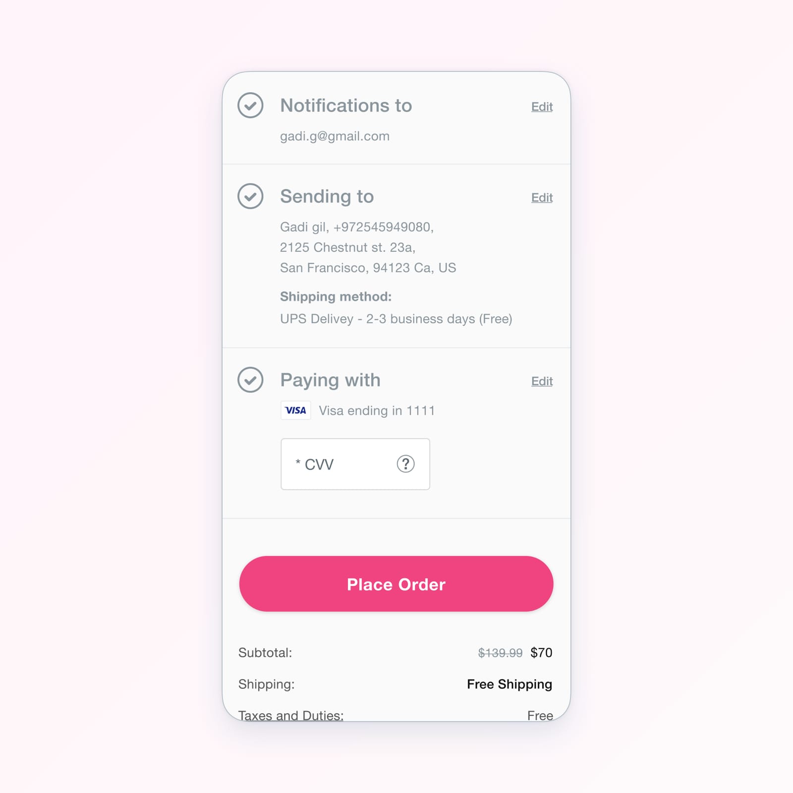
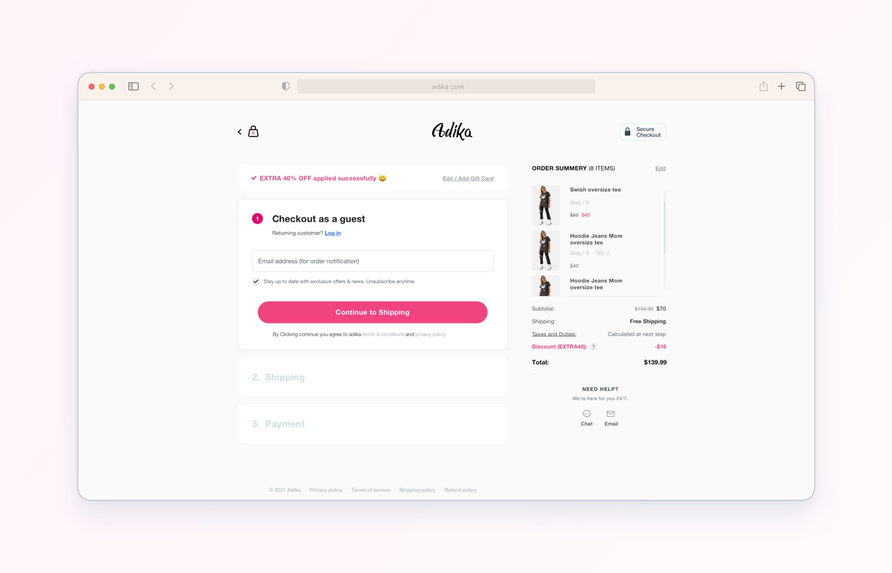
We designed a clear, user-friendly experience, dividing the checkout process into three distinct stages - Login, Shipping, and Payment. This approach made the process less overwhelming and helped users focus on one step at a time. Furthermore, all crucial information was provided at each stage, keeping customers informed and within the conversion funnel.
✅ Identification: The process started with a simplified login phase/guess, allowing quick access while maintaining security and personalization.
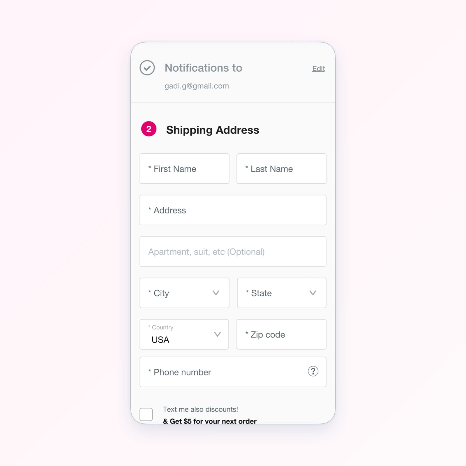
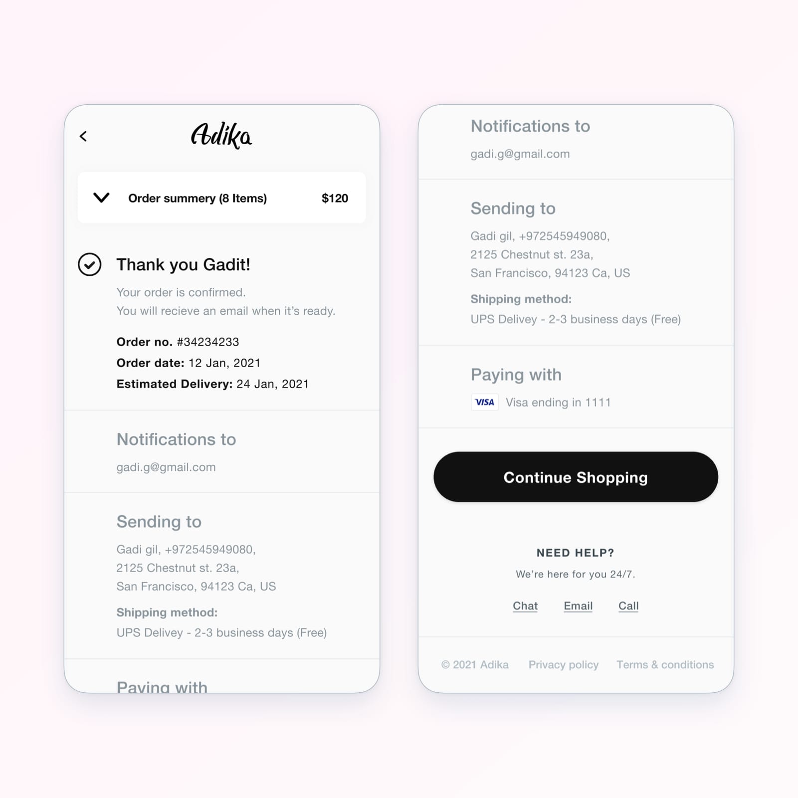
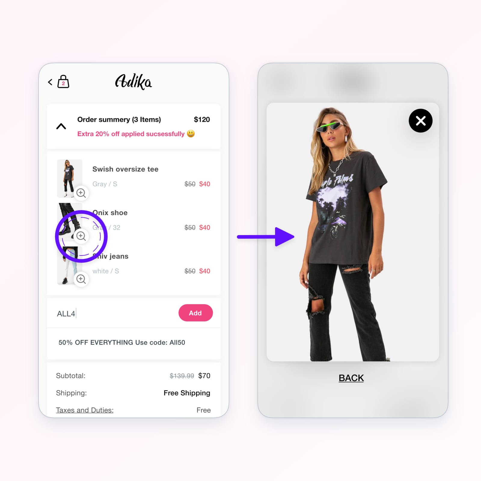
📦 Shipping: Following this, customers were guided through a user-friendly shipping process. Here, ease of entering addresses and reviewing order details was prioritized, ensuring that the customers were aware and in control of their purchasing decisions.
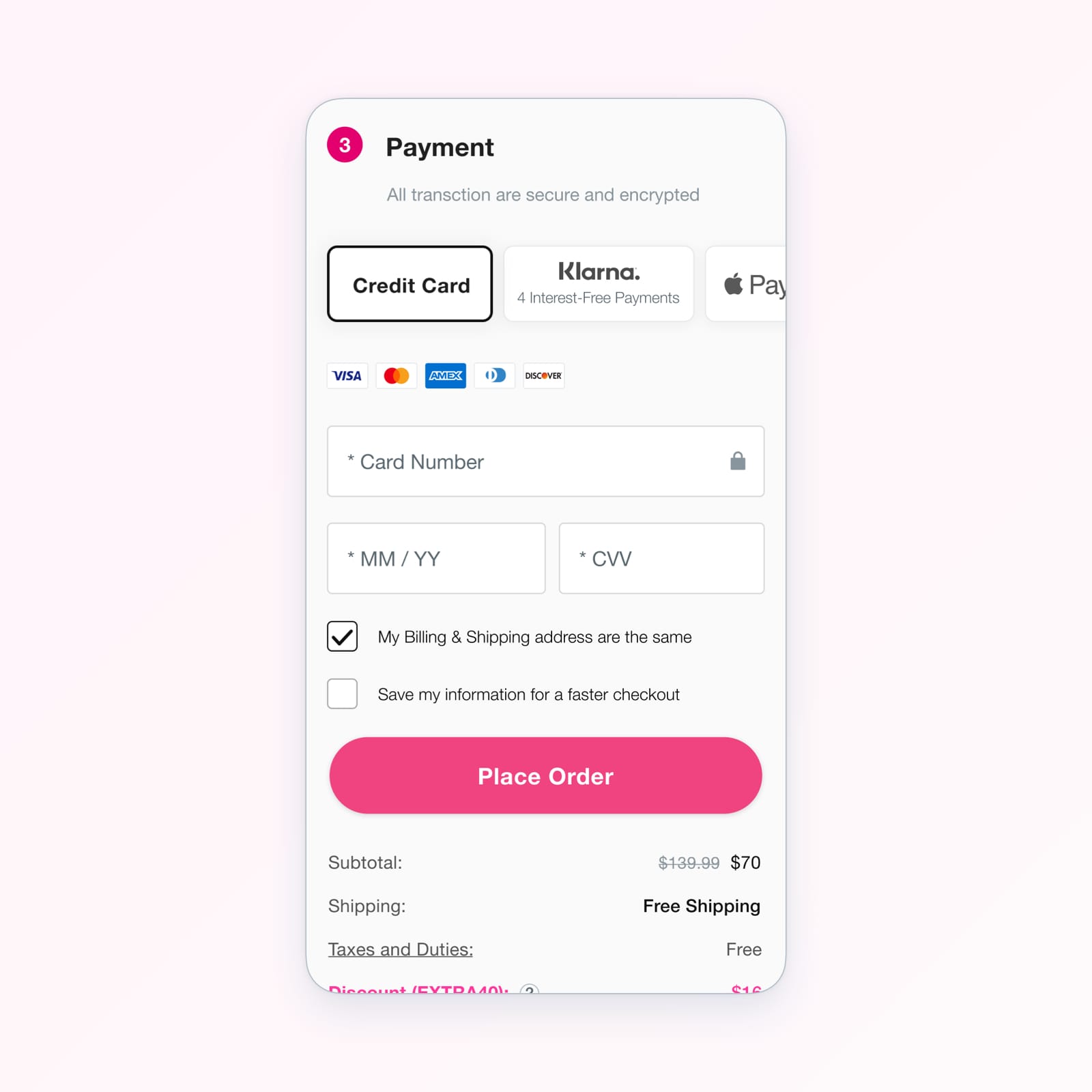
💰 Payment: The final part of the puzzle was the payment process. We ensured this was efficient and frictionless, employing trusted payment gateways and providing various payment options to cater to a broad range of customer preferences.
⭐ For already logged-in customers, these steps were bypassed, making the checkout even more streamlined.
Moreover, we tackled common user hesitations head-on. Trust symbols, comprehensive product descriptions, and user reviews were strategically placed to assure customers of the site's security, reliability, and quality of our products. By directly addressing these concerns within the checkout process, we created a carefree and seamless checkout experience.
Quick buys:
The reimagined checkout experience has been a triumph for Adika. Customers have appreciated the enhanced control, smooth navigation, and transparency. This sense of power not only increased conversion rates but also fostered a deeper connection between Adika and its customers. The more accessible and satisfying the checkout process, the higher the likelihood of repeat purchases.
Conclusion:
Adika's successful checkout optimization project demonstrates the transformative power of a customer-centric approach. By focusing on what customers want - control, ease, and speed - they have created a seamless checkout process that has proven successful in fostering customer loyalty and increasing conversion rates.
Here are some key takeaways and best practices drawn from Adika's success that can guide your e-commerce checkout optimization:
❇️ Simplicity: Avoid overwhelming your customers with too many steps or options at a time. Break down the process into manageable stages, guiding the customers through each.
❇️ Transparency: Provide all the essential information to the customer at each stage. This includes product details, costs, delivery time, and more. This ensures the customers know what they're getting into and builds trust.
❇️ Address user concerns: Understand common customer concerns, such as security and reliability, and address them proactively in your checkout process. This can be done by displaying security badges, customer reviews, and clear refund policies.
❇️ Offer multiple payment options: Cater to a broad range of customer preferences by offering various payment options. This reduces the chance of customers abandoning the cart because their preferred payment method is unavailable.
❇️ Mobile-first approach: With the increasing trend of mobile shopping, ensure your checkout process is optimized for mobile devices. This means responsive design, more prominent buttons for easy touch navigation, and ensuring the process is as smooth on a small screen as on a desktop.
This case study is a vivid testament to the fact that success is inevitable when businesses listen to their customers and adapt their strategies accordingly. The path to purchase may be a journey, but as Adika has shown, a smooth journey leads to a satisfying destination. Embracing these best practices in your checkout process could lead you down a similarly successful path.


