

When Yves Rocher asked me to rethink their U.S. website, I knew it would be more than just a redesign.
It’s easy to change colors, fonts, and layouts. It’s harder to take a French beauty brand with deep botanical roots and translate it into something that feels natural in America without losing its soul.
So before pushing pixels, I looked at the data. Where people dropped off. What worked. What didn’t. Because design without listening - whether to people or to numbers - is just decoration.
The challenge was to find balance: clean and natural, like the French countryside where the brand was born, but also bold, social, and engaging enough for the U.S. market.

Promise, not just products
The homepage needed to make a promise. Not just “we sell beauty products,” but we see you, we have a solution for you.
That’s why we highlighted bestsellers tied to real-life problems. Skincare isn’t abstract - it’s personal. If you struggle with dry skin, you don’t want to browse through categories; you want to know what works.
We also put real people front and center. Not glossy, untouchable campaigns. Real lives, real results. Because Yves Rocher is a brand built on authenticity and values, and I wanted the homepage to mirror that.
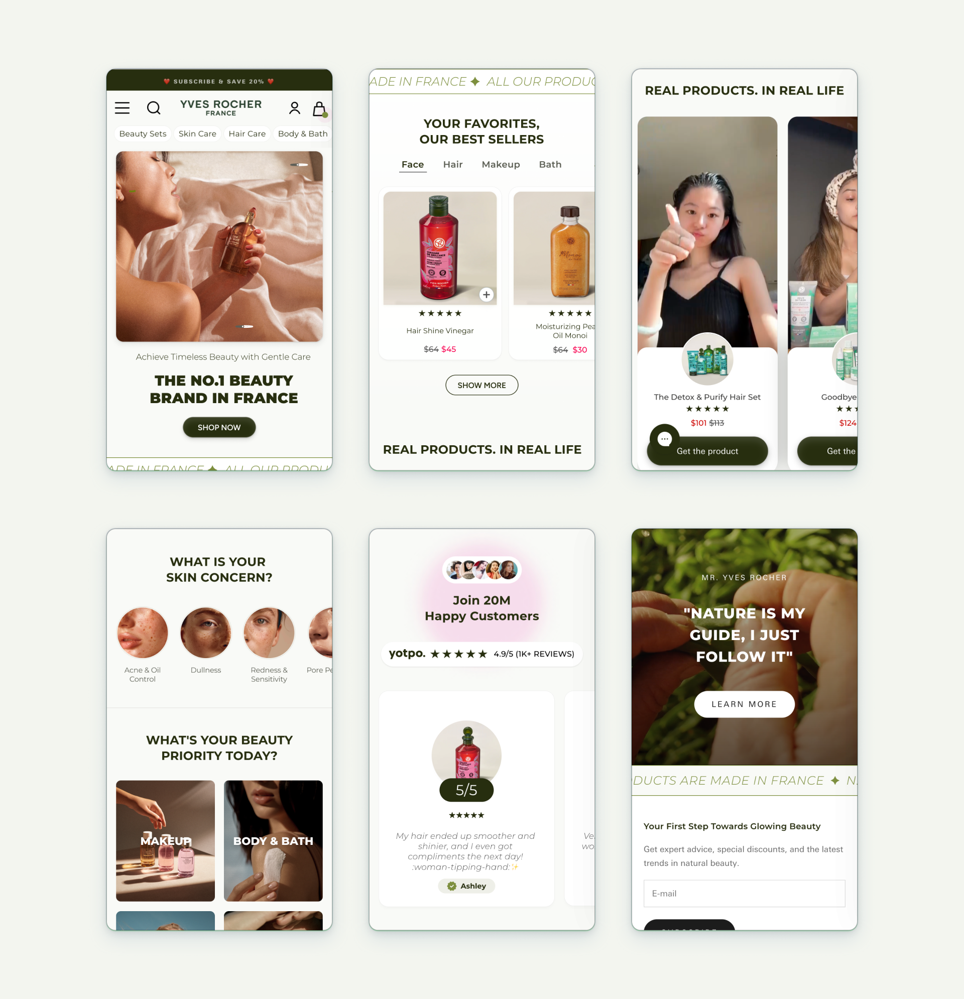
Transparency wins
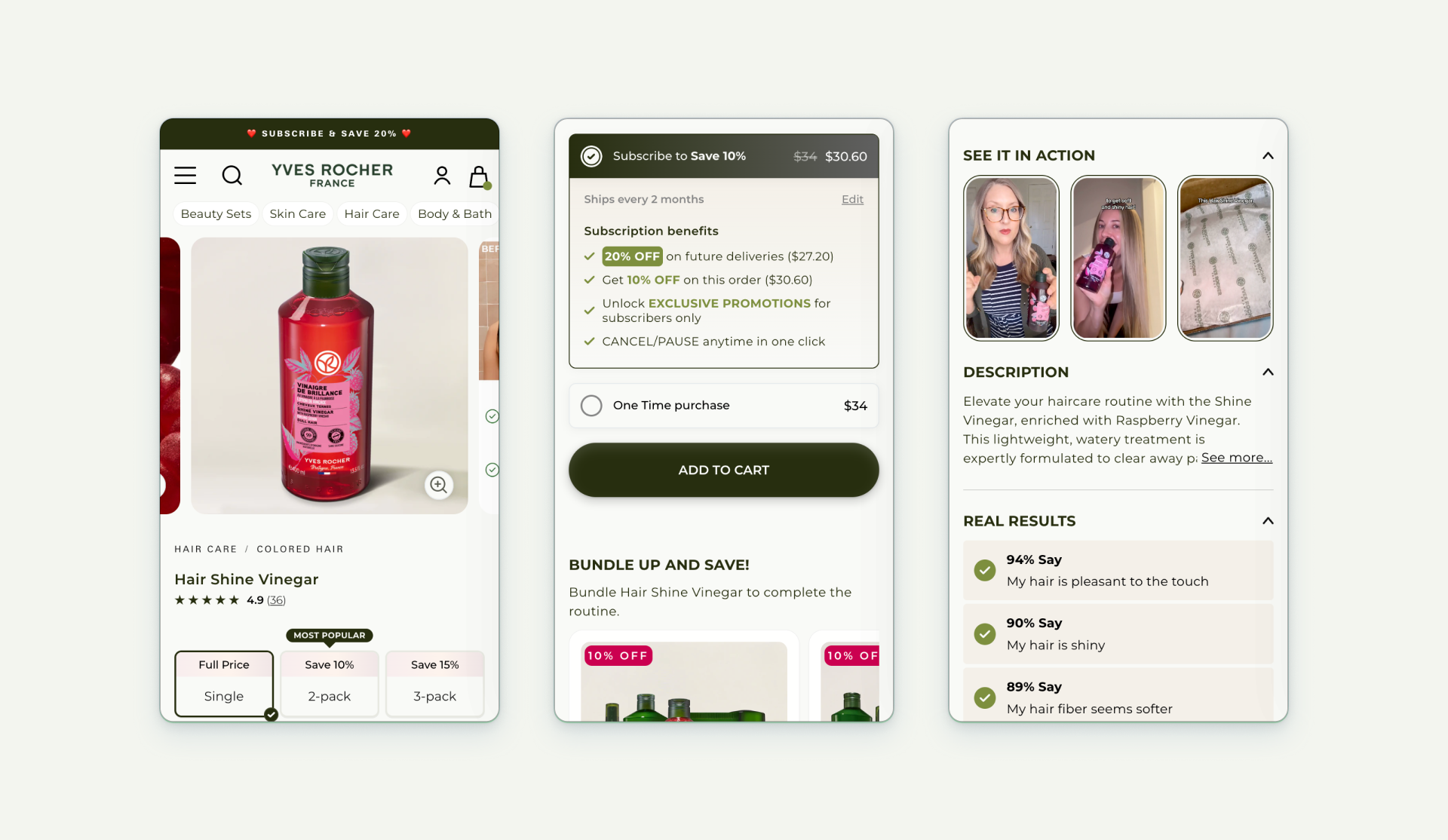
In the beauty industry, too many brands hide behind buzzwords. With Yves Rocher, I wanted the opposite.
Every product page puts the botanical ingredients first. What’s inside? What does it solve? Why should you care? The goal was transparency and trust.
We also added the option to subscribe. Because if you love a product, it shouldn’t be a one-time fling, it should be a ritual.
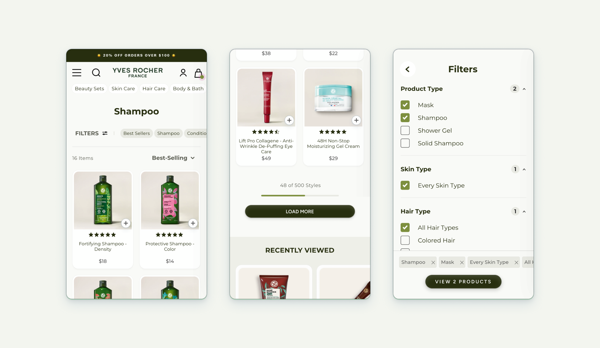
Clarity over clutter
Category pages are where people go when they’re not exactly sure what they want. That means clarity is everything.
We kept the design clean and scan-friendly with smart filters. No overwhelming grids, no clutter. Just a simple path to the right solution.
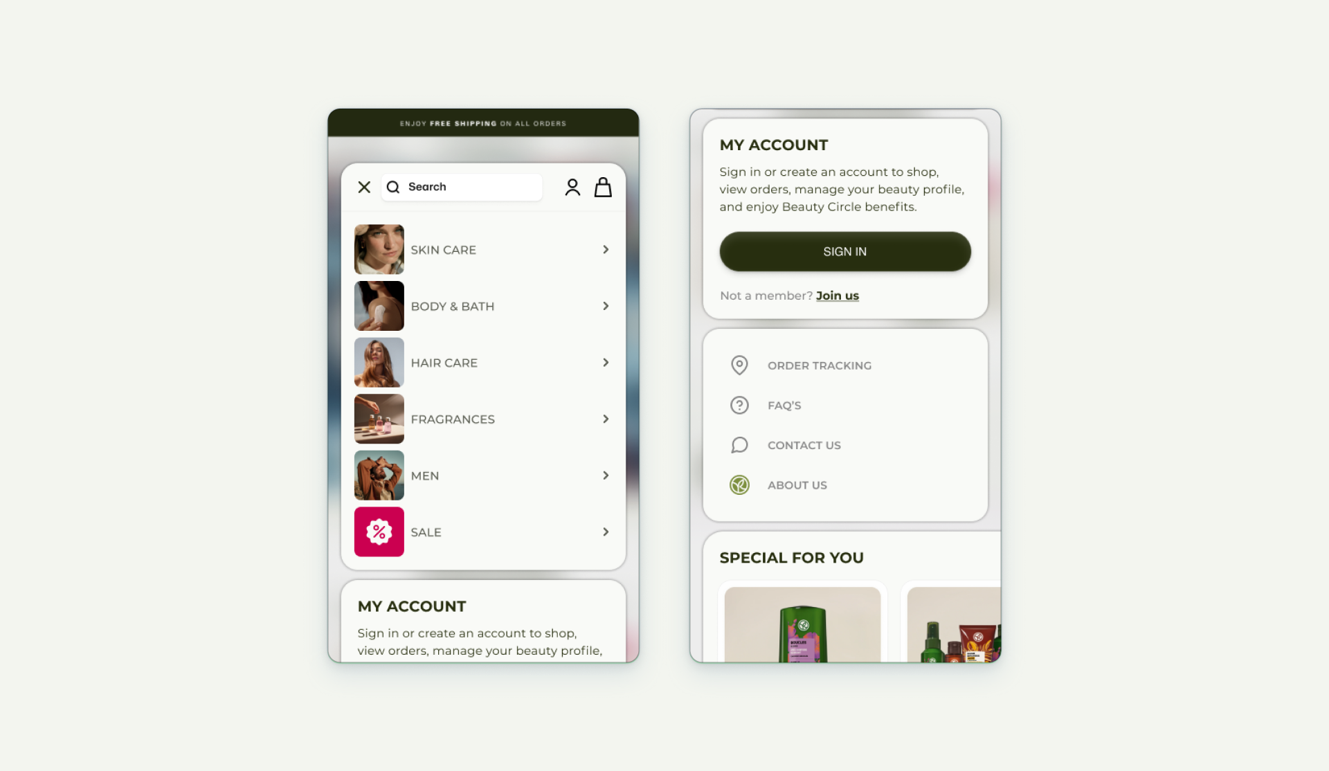
The invisible hero
The mobile menu is the silent workhorse of any e-commerce site. For Yves Rocher, it had to be fast, intuitive, and aesthetic - just like the products themselves.
Whether you’re looking for skincare, haircare, or a free sample, the menu makes it effortless.
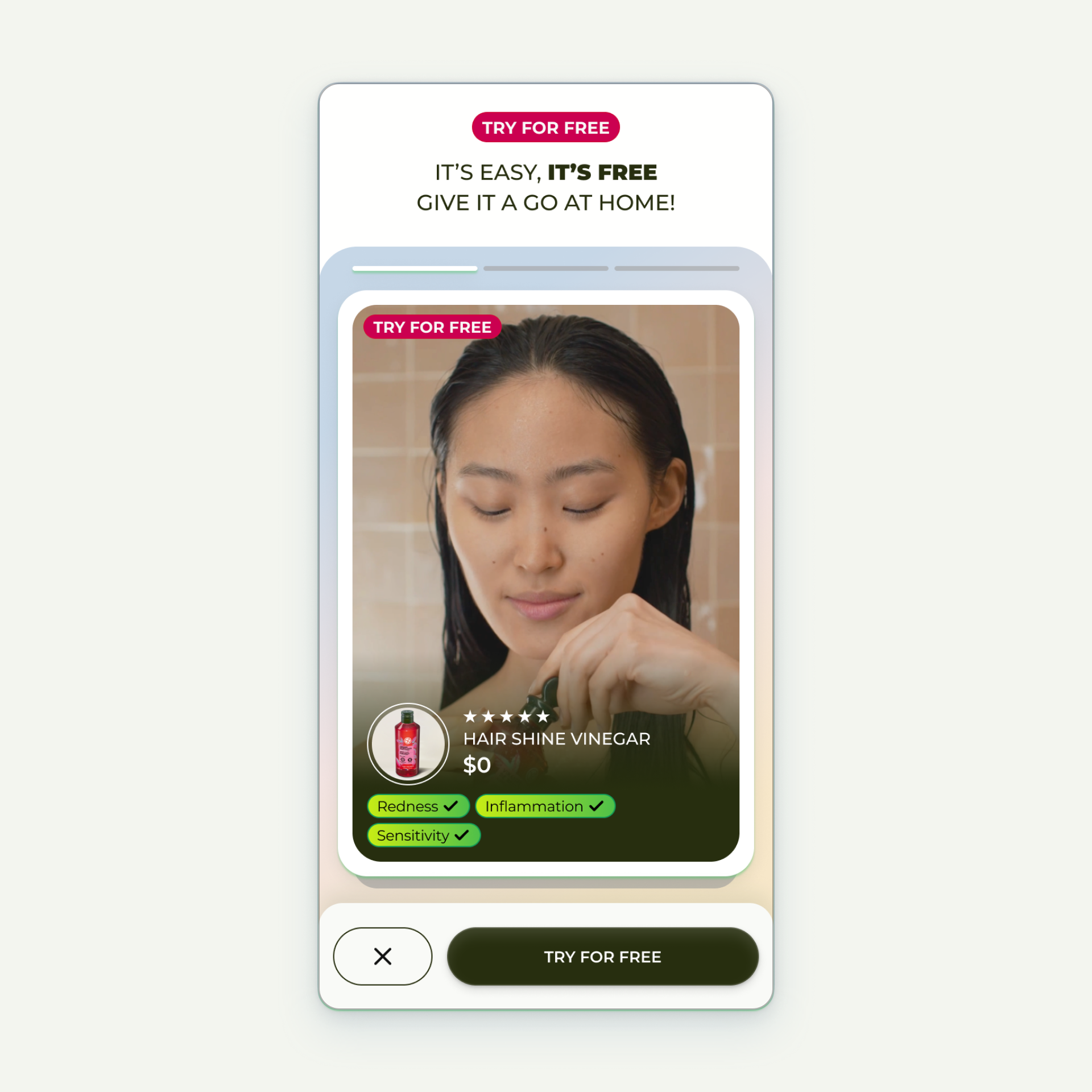
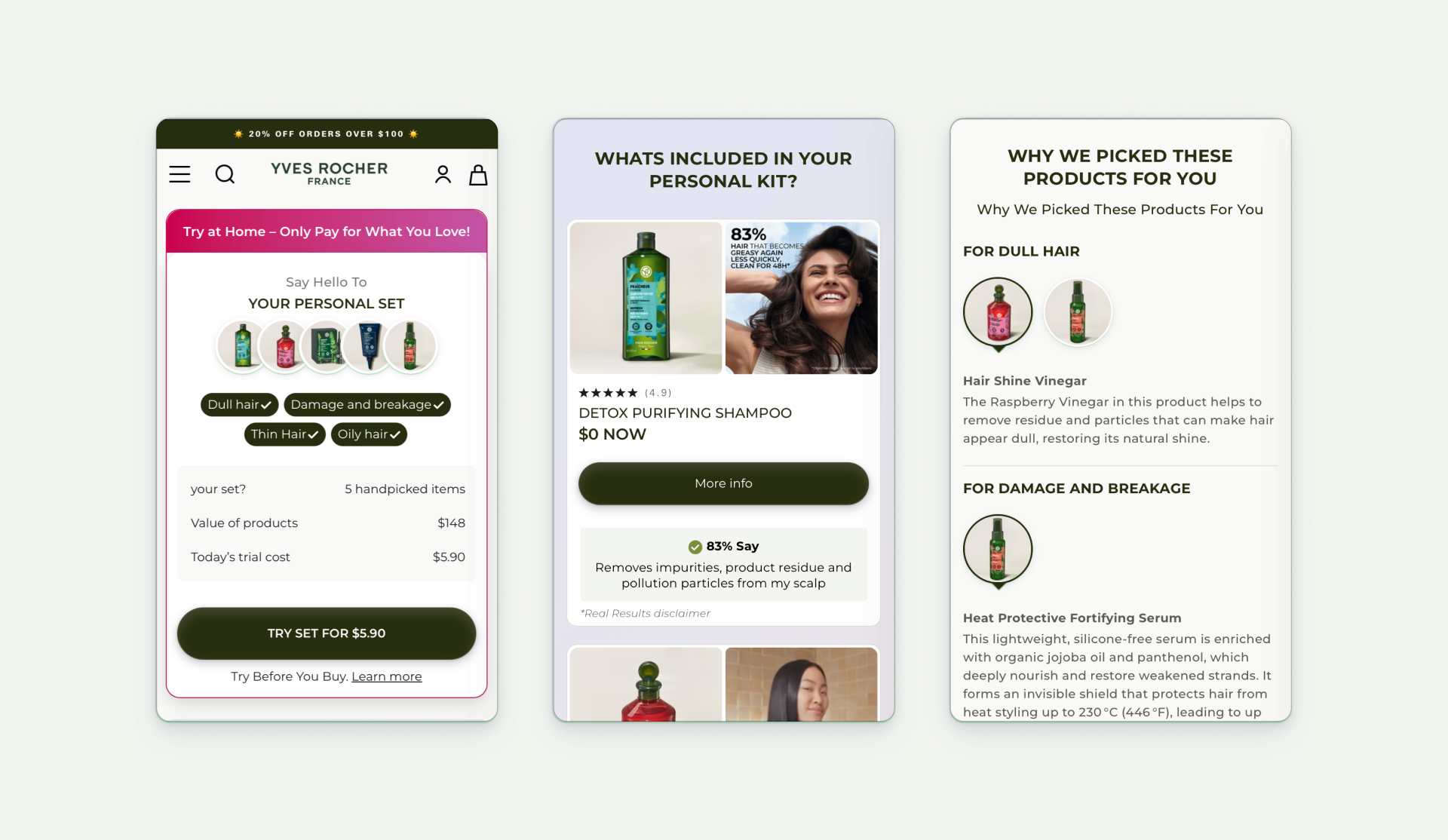
Confidence in a box
One of the boldest moves was offering free trials at home. Because the best way to believe in a product is to use it. If you don’t love it, you send it back. Simple.
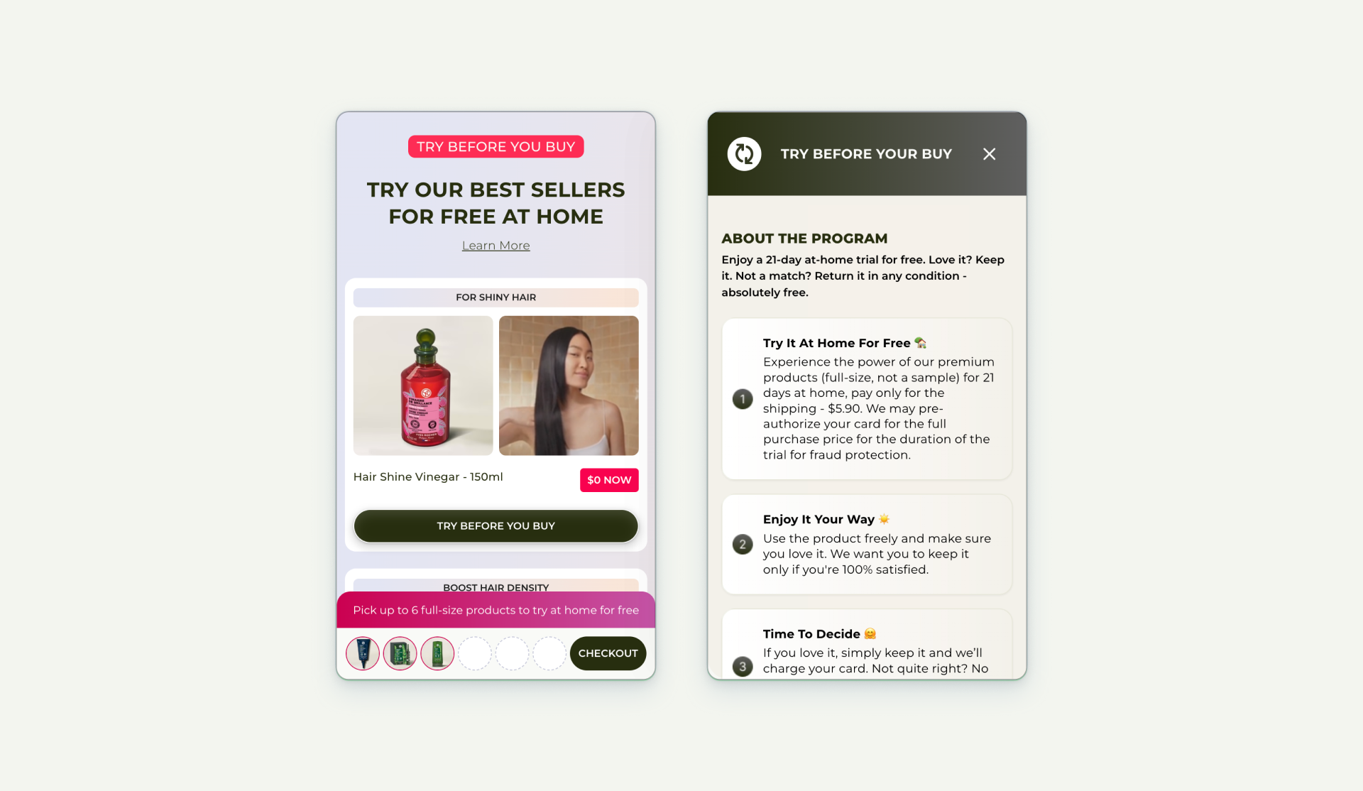
It’s not just marketing. It’s Yves Rocher standing behind its products with full confidence.
The moment of truth
Carts are often overlooked, but they’re where decisions happen. I wanted Yves Rocher’s cart to feel like a moment of control, not confusion.
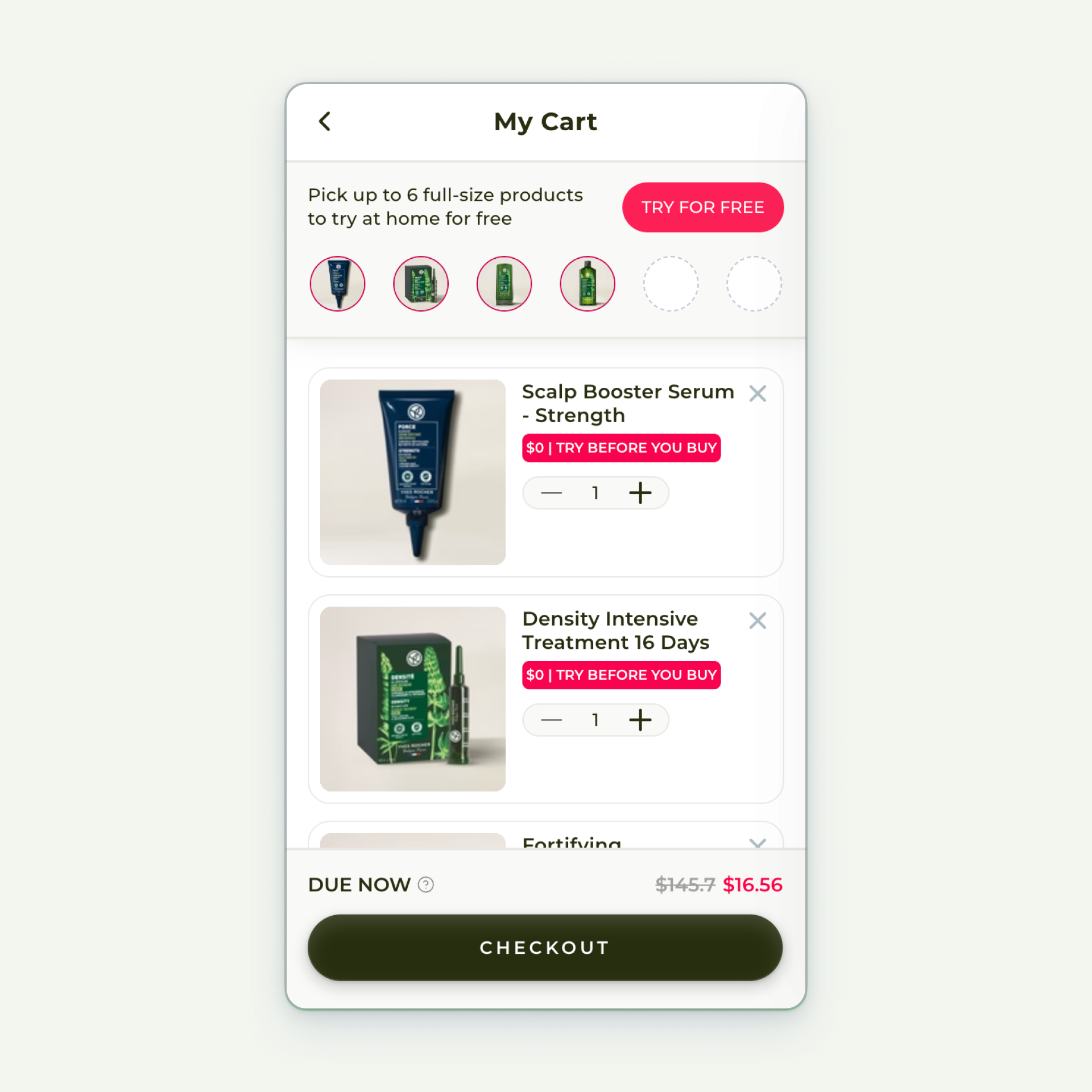
You always know what’s inside, but you’re also gently invited to try something new. Think of it as a Tinder for products - swipe in a free sample, test it at home, and maybe fall in love.
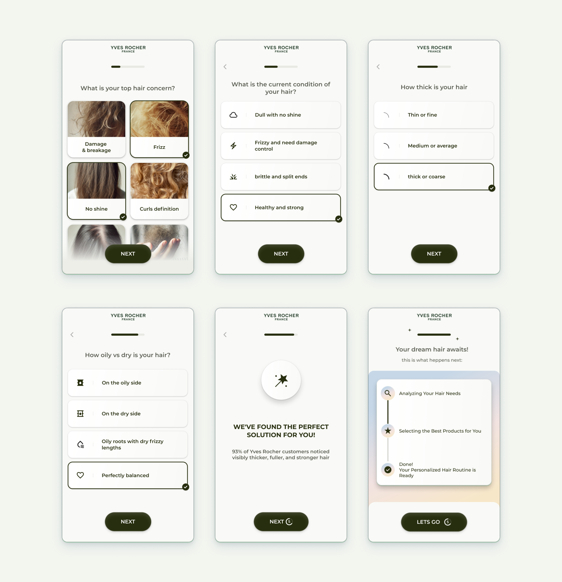
Guidance, not guesswork
Not everyone knows exactly what their hair needs. That’s where the Hair Quiz comes in.
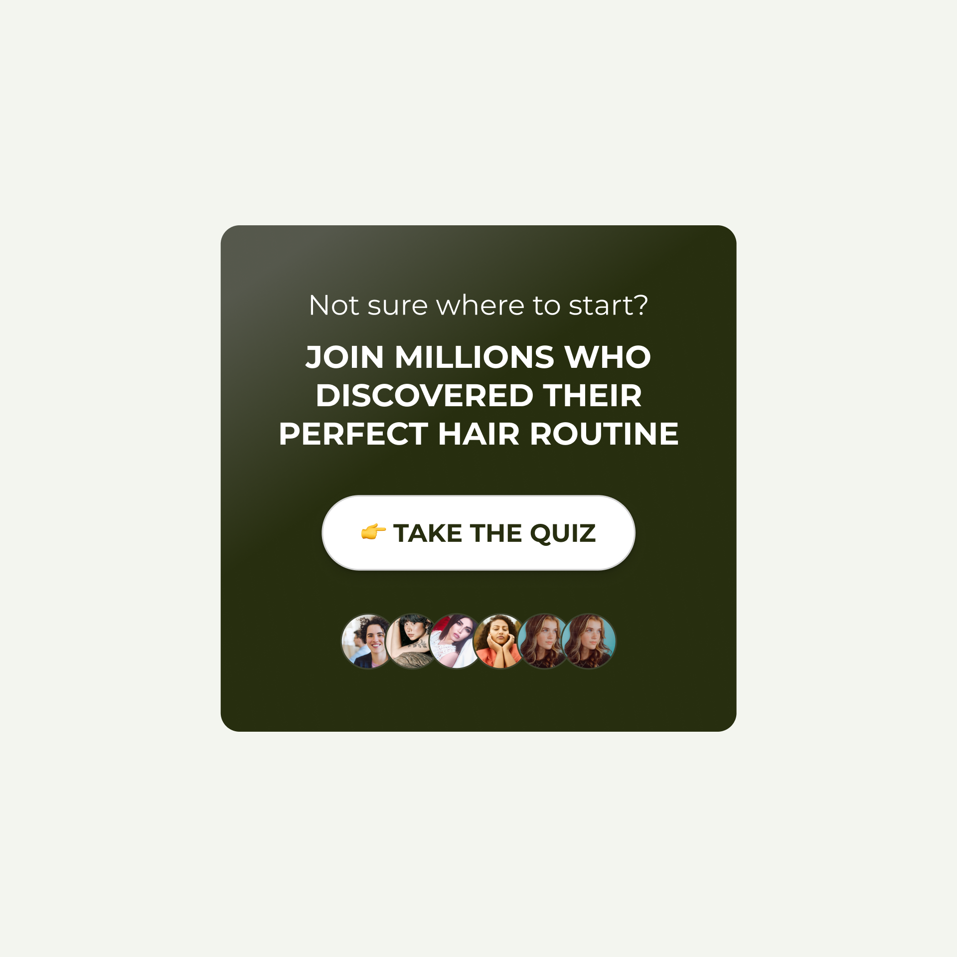
A few thoughtful questions, and suddenly you have a personalized recommendation. It’s part education, part guidance, part fun. Most importantly, it reduces friction and fosters trust.
What I learned
This project wasn’t just about pixels. It was about blending cultures, values, and behaviors.
🇫🇷 From France, we brought elegance, clarity, and botanical storytelling.
🇺🇸 From America, we embraced transparency, boldness, and social proof.
But maybe most importantly, it was about learning from the data. Looking at drop-offs, missed opportunities, and hidden behaviors shaped just as many design decisions as moodboards or wireframes.
In the end, the site didn’t just look new. It worked better. It built trust, simplified choices, and helped Yves Rocher grow its U.S. presence in a sustainable way.
And the lesson I take with me? Design leadership is not just about creating - it’s about listening. To people, to brands, and yes, even to the numbers.


